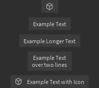
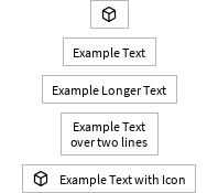
Button
A basic button that supports text, an icon, or both. This should be used as a standalone button or as a secondary button alongside a MainButton for the primary action in a group of options.
| Dark | Light |
|---|---|
|
|
The OnActivated prop should be a callback which is run when the button is clicked.
For example:
local function MyComponent()
	return React.createElement(StudioComponents.Button, {
		Text = "Click Me",
		OnActivated = function()
			print("Button clicked!")
		end
	})
end
The default size of buttons can be found in Constants.DefaultButtonHeight. To override this, there are two main options, which may be combined:
- Pass a
Sizeprop. - Pass an
AutomaticSizeprop.
AutomaticSize is a simpler version of Roblox's built-in AutomaticSize system. Passing a value of
Enum.AutomaticSize.X will override the button's width to fit the text and/or icon. Passing a
value of Enum.AutomaticSize.Y will do the same but with the button's height. Passing
Enum.AutomaticSize.XY will override both axes.
Types
IconProps
interface IconProps {Image: stringSize: Vector2Transparency: number?Color: Color3?UseThemeColor: boolean?Alignment: HorizontalAlignment?ResampleMode: Enum.ResamplerMode?RectOffset: Vector2?RectSize: Vector2?}
The Alignment prop is used to configure which side of any text the icon
appears on. Left-alignment is the default and center-alignment is not supported.
When specifying icon color, at most one of Color and UseThemeColor should be specified.
Props
Component Propsinterface Props {}