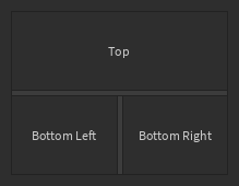
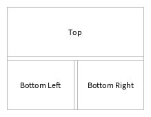
Splitter
A container frame similar to a Background but split into two panels, with a draggable control for resizing the panels within the container. Resizing one section to be larger will reduce the size of the other section, and vice versa. This is useful for letting users resize content.
| Dark | Light |
|---|---|
|
|
This is a controlled component. The current split location should be passed as a number between
0 and 1 to the Alpha prop, and a callback should be passed to the OnChanged prop, which
is run with the new alpha value when the user uses the splitter.
You can also optionally provide MinAlpha and MaxAlpha props (numbers between 0 and 1) which
limit the resizing. These values default to 0.1 and 0.9.
To render children in each side, use the children parameters in createElement and provide the
keys Side0 and Side1. For a complete example:
local function MyComponent()
	local division, setDivision = React.useState(0.5)
	return React.createElement(StudioComponents.Splitter, {
		Alpha = division,
		OnChanged = setDivision,
	}, {
		Side0 = React.createElement(...),
		Side1 = React.createElement(...),
	})
end
By default, the split is horizontal, which means that the frame is split into a left and right
side. This can be changed, for example to a vertical split (top and bottom), by providing an
Enum.FillDirection value to the FillDirection prop.
This component can use your system's splitter mouse icons when interacting with the splitter bar. To enable this behavior, ensure you have rendered a PluginProvider somewhere higher up in the tree.
Types
Props
Component Propsinterface Props {...: CommonPropsAlpha: numberOnChanged: ((newAlpha: number) → ())?FillDirection: Enum.FillDirection?MinAlpha: number?MaxAlpha: number?children: {Side0: React.ReactNode?,Side1: React.ReactNode?}?}