Dropdown
A togglable popup box containing a list of items to select a single item from.
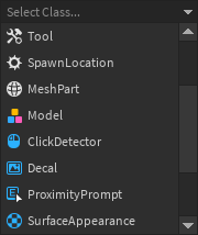
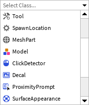
Clicking the top section of a dropdown opens the list. Selecting an item, clicking anywhere else, or pressing the Escape key will close the dropdown list. The list renders above all other UI elements under the same LayerCollector.
| Dark | Light |
|---|---|
|
|
By default, the dropdown list opens below the top section. However, if there is not enough space below, and there is more space above, the dropdown list will open upwards instead.
The height of the top row can also be customized by passing a Size prop. The default size of the
top row can be found in Constants.DefaultDropdownHeight.
The height of the dropdown list box is determined by the RowHeight and MaxVisibleRows props.
The default height of a list row can be found in Constants.DefaultDropdownRowHeight.
Dropdowns manage their own open/closed state, but otherwise are controlled components.
This means that you need to manage the current selected item by passing a value to
SelectedItem and a callback value to OnItemSelected. For example:
local function MyComponent()
	local selected, setSelected = React.useState("Red")
	local items = {	"Red", "Green", "Blue" }
	return React.createElement(StudioComponents.Dropdown, {
		Items = items,
		SelectedItem = selected,
		OnItemSelected = setSelected,
	})
end
Dropdowns do not by themselves require a value to always be selected. To explicitly allow the
selected value to be cleared by the user, set the ClearButton prop to true.
Multiple selections are not supported.
The list of items to select from can be specified either as strings or a DropdownItemDetail array. Using the detailed item format allows custom text and icons to be displayed, as seen below:
local function MyComponent()
	local items = {
		{
			Id = "item-1",
			Text = "First Item",
			Icon = {
				Image = "rbxassetid://...",
				...
			},
		},
		...
	}
	...
	return React.createElement(StudioComponents.Dropdown, {
		Items = items,
		SelectedItem = "item-1",
		...
	})
end
When using the detailed item format, the value in SelectedItem and the values that
OnItemSelected is called with correspond to the Id field of an item in the Items array.
Types
Props
Component Propsinterface Props {...: CommonPropsOnItemSelected: ((newItem: string?) → ())?SelectedItem: string?DefaultText: string?RowHeight: number?MaxVisibleRows: number?ClearButton: boolean?}