TabContainer

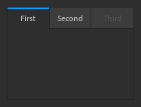
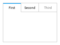
A container that displays one content page at a time, where different pages can be selected via a set of tabs along the top. This is seen in some built-in plugins such as the Toolbox.

Dark Light
Dark Light

This is a controlled component. The identifier of the selected tab should be passed to the SelectedTab prop, and a callback should be passed to the OnTabSelected prop which is run when the user selects a tab from the tab controls along the top.

The content rendered in each tab's main window should be passed to the children parameters in createElement in the format described below. The keys are used as tab names in the tab controls along the top and should also correspond to the identifier in SelectedTab and the identifiers that OnTabSelected prop may be called with. For example:

local function MyComponent()
	local selectedTab, setSelectedTab = React.useState("Models")
	return React.createElement(TabContainer, {
		SelectedTab = selectedTab,
		OnTabSelected = setSelectedTab,
	}, {
		["Models"] = {
			LayoutOrder = 1,
			Content = React.createElement(...),
		},
		["Decals"] = {
			LayoutOrder = 2,
			Content = React.createElement(...),
		}
	})
end

As well as disabling the entire component via the Disabled CommonProp, individual tabs can be disabled and made unselectable by passing Disabled with a value of true inside the tab's entry in the Tabs prop table.

info

The various tab containers found in Studio are inconsistent with each other (for example, Toolbox and Terrain Editor use different sizes, colors, and highlights). This design of this component uses the common elements of those designs and has small tweaks to stay consistent with the wider design of Studio elements.

Types

Tab

interface Tab {
LayoutOrdernumber
ContentReact.ReactNode
Disabledboolean?
}

Props

Component Props
interface Props {
SelectedTabstring
OnTabSelected((namestring) → ())?
children{[string]Tab}
}
Show raw api
{
    "functions": [],
    "properties": [],
    "types": [
        {
            "name": "Tab",
            "desc": "",
            "fields": [
                {
                    "name": "LayoutOrder",
                    "lua_type": "number",
                    "desc": ""
                },
                {
                    "name": "Content",
                    "lua_type": "React.ReactNode",
                    "desc": ""
                },
                {
                    "name": "Disabled",
                    "lua_type": "boolean?",
                    "desc": ""
                }
            ],
            "source": {
                "line": 66,
                "path": "src/Components/TabContainer.luau"
            }
        },
        {
            "name": "Props",
            "desc": "",
            "fields": [
                {
                    "name": "...",
                    "lua_type": "CommonProps",
                    "desc": ""
                },
                {
                    "name": "SelectedTab",
                    "lua_type": "string",
                    "desc": ""
                },
                {
                    "name": "OnTabSelected",
                    "lua_type": "((name: string) -> ())?",
                    "desc": ""
                },
                {
                    "name": "children",
                    "lua_type": "{ [string]: Tab }",
                    "desc": ""
                }
            ],
            "tags": [
                "Component Props"
            ],
            "source": {
                "line": 83,
                "path": "src/Components/TabContainer.luau"
            }
        }
    ],
    "name": "TabContainer",
    "desc": "A container that displays one content page at a time, where different pages can be selected\nvia a set of tabs along the top. This is seen in some built-in plugins such as the Toolbox.\n\n| Dark | Light |\n| - | - |\n| ![Dark](/StudioComponents/components/tabcontainer/dark.png) | ![Light](/StudioComponents/components/tabcontainer/light.png) |\n\nThis is a controlled component. The identifier of the selected tab should be passed to the\n`SelectedTab` prop, and a callback should be passed to the `OnTabSelected` prop which is run \nwhen the user selects a tab from the tab controls along the top.\n\nThe content rendered in each tab's main window should be passed to the `children` parameters in\n`createElement` in the [format](TabContainer#Tab) described below. The keys are used as tab names \nin the tab controls along the top and should also correspond to the identifier in `SelectedTab` \nand\tthe identifiers that `OnTabSelected` prop may be called with. For example:\n\n```lua\nlocal function MyComponent()\n\tlocal selectedTab, setSelectedTab = React.useState(\"Models\")\n\treturn React.createElement(TabContainer, {\n\t\tSelectedTab = selectedTab,\n\t\tOnTabSelected = setSelectedTab,\n\t}, {\n\t\t[\"Models\"] = {\n\t\t\tLayoutOrder = 1,\n\t\t\tContent = React.createElement(...),\n\t\t},\n\t\t[\"Decals\"] = {\n\t\t\tLayoutOrder = 2,\n\t\t\tContent = React.createElement(...),\n\t\t}\n\t})\nend\n```\n\nAs well as disabling the entire component via the `Disabled` [CommonProp](CommonProps), individual\ntabs can be disabled and made unselectable by passing `Disabled` with a value of `true` inside\nthe tab's entry in the `Tabs` prop table.\n\n:::info\nThe various tab containers found in Studio are inconsistent with each other (for example, Toolbox\nand Terrain Editor use different sizes, colors, and highlights). This design of this component\nuses the common elements of those designs and has small tweaks to stay consistent with the wider\ndesign of Studio elements.\n:::",
    "source": {
        "line": 50,
        "path": "src/Components/TabContainer.luau"
    }
}