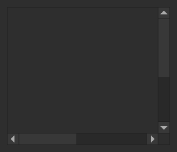
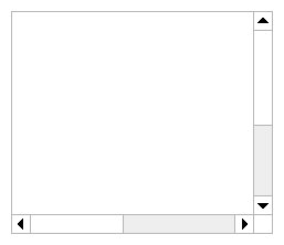
ScrollFrame
A container with scrollable contents. This works the same way as a built-in ScrollingFrame but has visual changes to match the appearance of built-in scrollers in Studio.
| Dark | Light |
|---|---|
|
|
ScrollFrames automatically size their canvas to fit their contents, which are passed via the
children parameters in createElement. By default, children are laid out with a UIListLayout;
this can be overriden via the Layout prop. Either "UIListLayout" or "UIGridLayout" may be
passed to Layout.ClassName. Any other properties to be applied to the layout should also be
passed in the Layout prop. For example:
local function MyComponent()
	return React.createElement(StudioComponents.ScrollFrame, {
		Layout = {
			ClassName = "UIListLayout",
			Padding = UDim.new(0, 10),
			FillDirection = Enum.FillDirection.Horizontal,
		}
	}, {
		SomeChild = React.createElement(...),
		AnotherChild = React.createElement(...),
	})
end
By default, scrolling on both the X and Y axes is enabled. To configure this, pass an
Enum.ScrollingDirection value to the ScrollingDirection prop. Padding around the outside of
contents can also be configured via the PaddingLeft, PaddingRight, PaddingTop, and
PaddingBottom props.
info
The built-in Studio scrollers were changed during this project's lifetime to be significantly narrower. This component retains the old, wider, size because it is more accessible.