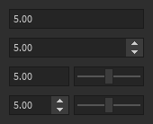
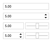
NumericInput
An input field matching the appearance of a TextInput but which filters inputted text to only allow numeric values, optionally with arrow and slider controls.
| Dark | Light |
|---|---|
|
|
This is a controlled component with similar behavior to TextInput. The current numeric value
to display should be passed to the Value prop, and a callback should be passed to the
OnValidChanged prop which is run when the user types a (valid) numeric input.
Optionally, a minimum value can be passed to the Min prop, as well as a maximum value to the
Max prop. A step (increment) value may also be passed to the the Step prop, which defaults
to 1 (allowing only whole number values). Passing a non-integer step value will also allow a
decimal point to be typed in the input box.
Use the Arrows and Slider props to specify whether up/down arrows and a slider should be
included. If arrows or a slider are displayed, they will increment the value by the amount of the step.
Completing a slide with a slider will call the OnSubmitted prop (if provided) with the latest value.
Only decimal inputs are allowed (so, for example, hex characters a-f will not be permitted).
Types
Props
Component Propsinterface Props {...: CommonPropsValue: numberOnValidChanged: ((n: number) → ())?Min: number?Max: number?Step: number?OnSubmitted: ((n: number) → ())?FormatValue: ((n: number) → string)?Arrows: boolean?Slider: boolean?PlaceholderText: string?ClearTextOnFocus: boolean?OnFocused: (() → ())?}