ProgressBar
A basic progress indicator. This should be used for longer or more detailed loading processes. For shorter loading processes, consider using a LoadingDots component.
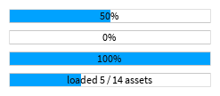
| Dark | Light |
|---|---|
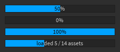
|
|
Pass a number representing the current progress into the Value prop. You can optionally pass a
number representing the maximum value into the Max prop, which defaults to 1 if not provided.
The Value prop should be between 0 and Max. For example:
local function MyComponent()
	return React.createElement(StudioComponents.ProgressBar, {
		Value = 5, -- loaded 5 items
		Max = 10, -- out of a total of 10 items
	})
end
By default, the progress bar will display text indicating the progress as a percentage,
rounded to the nearest whole number. This can be customized by providing a prop to Formatter,
which should be a function that takes two numbers representing the current value and the maximum value
and returns a string to be displayed. For example:
local function MyComponent()
	return React.createElement(StudioComponents.ProgressBar, {
		Value = 3,
		Max = 20,
		Formatter = function(current, max)
			return `Loaded {current} / {max} assets...`
		end,
	})
end
By default, the height of a progress bar is equal to the value in Constants.DefaultProgressBarHeight. This can be configured via props.
Types
Props
Component Propsinterface Props {}