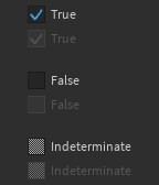
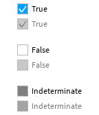
Checkbox
A box which can be checked or unchecked, usually used to toggle an option. Passing a value to
the Label prop is the recommended way to indicate the purpose of a checkbox.
| Dark | Light |
|---|---|

|

|
As this is a controlled component, you should pass a value to the Value prop representing
whether the box is checked, and a callback value to the OnChanged prop which gets run when
the user interacts with the checkbox. For example:
local function MyComponent()
	local selected, setSelected = React.useState(false)
	return React.createElement(StudioComponents.Checkbox, {
		Value = selected,
		OnChanged = setSelected,
	})
end
The default height of a checkbox, including its label, can be found in Constants.DefaultToggleHeight.
The size of the whole checkbox can be overridden by passing a value to the Size prop.
By default, the box and label are left-aligned within the parent frame. This can be overriden by
passing an Enum.HorizontalAlignment value to the ContentAlignment prop.
By default, the box is placed to the left of the label. This can be overriden by passing either
Enum.HorizontalAlignment.Left or Enum.HorizontalAlignment.Right to the
ButtonAlignment prop.
Checkboxes can also represent 'indeterminate' values, which indicates that it is neither
checked nor unchecked. This can be achieved by passing nil to the Value prop.
This might be used when a checkbox represents the combined state of two different options, one of
which has a value of true and the other false.
info
The built-in Studio checkboxes were changed during this project's lifetime to be smaller and have a lower contrast ratio, especially in Dark theme. This component retains the old design as it is more accessible.
Types
Props
Component Propsinterface Props {...: CommonPropsValue: boolean?OnChanged: (() → ())?Label: string?ContentAlignment: HorizontalAlignment?ButtonAlignment: HorizontalAlignment?}