DatePicker

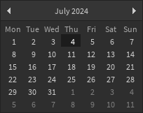
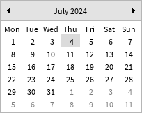
An interface for selecting a date from a calendar.

Dark Light
Dark Light

This is a controlled component, which means you should pass in an initial date to the Date prop and a callback value to the OnChanged prop which gets called with the new date when the user selects one. For example:

local function MyComponent()
	local date, setDate = React.useState(DateTime.now())
	return React.createElement(StudioComponents.DatePicker, {
		Date = date,
		OnChanged = setDate,
	})
end

In most cases the desired behavior would be to close the interface once a selection is made, in which case you can use the OnChanged prop as a trigger for this.

The default size of this component is exposed in Constants.DefaultDatePickerSize. To keep all inputs accessible, it is recommended not to use a smaller size than this.

This component is not a modal or dialog box (this should be implemented separately).

Types

Props

Component Props
interface Props {
DateDateTime
OnChanged(newDateDateTime) → ()
}
Show raw api
{
    "functions": [],
    "properties": [],
    "types": [
        {
            "name": "Props",
            "desc": "",
            "fields": [
                {
                    "name": "...",
                    "lua_type": "CommonProps",
                    "desc": ""
                },
                {
                    "name": "Date",
                    "lua_type": "DateTime",
                    "desc": ""
                },
                {
                    "name": "OnChanged",
                    "lua_type": "(newDate: DateTime) -> ()",
                    "desc": ""
                }
            ],
            "tags": [
                "Component Props"
            ],
            "source": {
                "line": 182,
                "path": "src/Components/DatePicker.luau"
            }
        }
    ],
    "name": "DatePicker",
    "desc": "An interface for selecting a date from a calendar.\n\n| Dark | Light |\n| - | - |\n| ![Dark](/StudioComponents/components/datepicker/dark.png) | ![Light](/StudioComponents/components/datepicker/light.png) |\n\nThis is a controlled component, which means you should pass in an initial date to the `Date`\nprop and a callback value to the `OnChanged` prop which gets called with the new date when\nthe user selects one. For example:\n\n```lua\nlocal function MyComponent()\n\tlocal date, setDate = React.useState(DateTime.now())\n\treturn React.createElement(StudioComponents.DatePicker, {\n\t\tDate = date,\n\t\tOnChanged = setDate,\n\t})\nend\n```\n\nIn most cases the desired behavior would be to close the interface once a selection is made,\nin which case you can use the `OnChanged` prop as a trigger for this.\n\nThe default size of this component is exposed in [Constants.DefaultDatePickerSize].\nTo keep all inputs accessible, it is recommended not to use a smaller size than this.\n\nThis component is not a modal or dialog box (this should be implemented separately).",
    "source": {
        "line": 32,
        "path": "src/Components/DatePicker.luau"
    }
}