ColorPicker

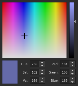
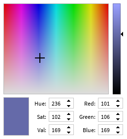
An interface for selecting a color with a Hue / Saturation box and a Value slider. Individual RGB and HSV values can also be modified manually.

Dark Light
Dark Light

This is a controlled component, which means the current color should be passed in to the Color prop and a callback value to the OnChanged prop which gets run when the user attempts to change the color. For example:

local function MyComponent()
	local color, setColor = React.useState(Color3.fromHex("#008080"))
	return React.createElement(StudioComponents.ColorPicker, {
		Value = color,
		OnChanged = setColor,
	})
end

The default size of this component is exposed in Constants.DefaultColorPickerSize. To keep all inputs accessible, it is recommended not to use a smaller size than this.

This component is not a modal or dialog box (this should be implemented separately).

Types

Props

Component Props
interface Props {
ColorColor3
OnChanged((newColorColor3) → ())?
}
Show raw api
{
    "functions": [],
    "properties": [],
    "types": [
        {
            "name": "Props",
            "desc": "",
            "fields": [
                {
                    "name": "...",
                    "lua_type": "CommonProps",
                    "desc": ""
                },
                {
                    "name": "Color",
                    "lua_type": "Color3",
                    "desc": ""
                },
                {
                    "name": "OnChanged",
                    "lua_type": "((newColor: Color3) -> ())?",
                    "desc": ""
                }
            ],
            "tags": [
                "Component Props"
            ],
            "source": {
                "line": 54,
                "path": "src/Components/ColorPicker.luau"
            }
        }
    ],
    "name": "ColorPicker",
    "desc": "An interface for selecting a color with a Hue / Saturation box and a Value slider.\nIndividual RGB and HSV values can also be modified manually.\n\n| Dark | Light |\n| - | - |\n| ![Dark](/StudioComponents/components/colorpicker/dark.png) | ![Light](/StudioComponents/components/colorpicker/light.png) |\n\nThis is a controlled component, which means the current color should be passed in to the\n`Color` prop and a callback value to the `OnChanged` prop which gets run when the user attempts \nto change the color. For example:\n\n```lua\nlocal function MyComponent()\n\tlocal color, setColor = React.useState(Color3.fromHex(\"#008080\"))\n\treturn React.createElement(StudioComponents.ColorPicker, {\n\t\tValue = color,\n\t\tOnChanged = setColor,\n\t})\nend\n```\n\nThe default size of this component is exposed in [Constants.DefaultColorPickerSize].\nTo keep all inputs accessible, it is recommended not to use a smaller size than this.\n\nThis component is not a modal or dialog box (this should be implemented separately).",
    "source": {
        "line": 29,
        "path": "src/Components/ColorPicker.luau"
    }
}