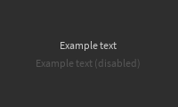
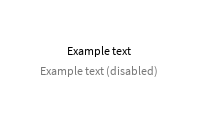
Label
A basic text label with default styling to match built-in labels as closely as possible.
| Dark | Light |
|---|---|

|

|
By default, text color matches the current theme's MainText color, which is the color used in the Explorer and Properties widgets as well as most other places. It can be overriden in two ways:
-
Passing a StudioStyleGuideColor
to the
TextColorStyleprop. This is the preferred way to recolor text because it will use the correct version of the color for the user's current selected theme. -
Passing a Color3 value to the
TextColor3prop. This is useful when a color is not represented by any StudioStyleGuideColor or should remain constant regardless of theme.
Example of creating an error message label:
local function MyComponent()
	return React.createElement(StudioComponents.Label, {
		Text = "Please enter at least 5 characters!",
		TextColorStyle = Enum.StudioStyleGuideColor.ErrorText,
	})
end
Plugins like Theme Color Shower are useful for finding a StudioStyleGuideColor to use.
This component will parent any children passed to it to the underlying TextLabel instance. This is useful for things like adding extra padding around the text using a nested UIPadding, or adding a UIStroke / UIGradient.
Labels use Constants.DefaultFont for Font and Constants.DefaultTextSize for TextSize. This cannot currently be overriden via props.
Types
Props
Component Propsinterface Props {...: CommonPropsText: stringTextWrapped: boolean?TextXAlignment: Enum.TextXAlignment?TextYAlignment: Enum.TextYAlignment?TextTruncate: Enum.TextTruncate?TextTransparency: number?TextColor3: Color3?RichText: boolean?MaxVisibleGraphemes: number?TextColorStyle: Enum.StudioStyleGuideColor?children: React.ReactNode}